


The first time I heard about Solid it sounded really scary, however, I was able to adapt after a few studies and practical experimentation.
S.O.L.I.D refers to five design principles for writing maintainable and scalable software.
One thing to note is solid isn't a react concept but rather a Software engineering design concept that is language or framework agnostic and can be applied in any codebase.
Single Responsibility Principle (SRP) - A class should have only one reason to change.
Open-Closed Principle (OCP) - Software entities (classes, modules, functions, etc.) should be open for extension but closed for modification.
Liskov Substitution Principle (LSP) - Subtypes must be substitutable for their base types.
Interface Segregation Principle (ISP) - Clients should not be forced to depend on interfaces they do not use.
Dependency Inversion Principle (DIP) - High-level modules should not depend on low-level modules. Both should depend on abstractions.
For this article, I will be using react to properly explain the SOLID design principle.
Single Responsibility Principle (SRP)
This simply means every function or class should have one thing they are doing. This can also mean separation of concern. The law of separation of concern is simple, it states that different logic that performs different actions should not be combined.
In React we cannot talk about the separation of concerns without talking about Presentational and Container components.
Presentational Components: They are usually used for displaying data. They are usually stateless and are independent of the data coming in. They are children of Container components. Presentational components are usually stateless.
Container Components: In React, container components play a key role in managing the logic and state of an application. They act as a link between the presentation components and the data store/backend and are typically implemented using class components or the useReducer hook. Unlike presentational components, container components do not render any UI themselves, but rather pass data and behavior to the presentation components through props, which then handle the rendering of the UI.
To separate logic in React apps
Let's say you have a component that displays a list of items and also has the functionality to add new items to the list. Instead of having all the logic for displaying and adding items in a single component, you can split it into two separate components: one for displaying the list and another for adding items.
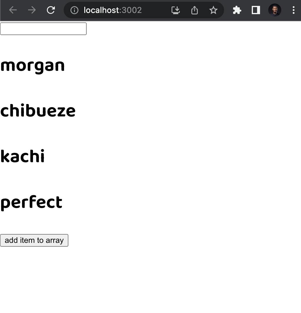
function App() {
  const [items, setItems] = useState([
    { name: "morgan" },
    { name: "chibueze" },
    { name: "kachi" },
    { name: "perfect" },
  ]);

  const [input, setInput] = useState("");

  const handleAddItem = () => {
    setItems([...items, { name: input }]);
    setInput("");
  };

  const handleChange = (e) => {
    setInput(e?.target?.value);
  };

  return (
    <div>
      <input value={input} onChange={handleChange} />
      {items.map((x) => (
        <h1>{x.name}</h1>
      ))}

      <button onClick={handleAddItem}>add item to array</button>
    </div>
  );
}
Although the component is relatively short, it does quite some things like rendering a list of names, addding name and does input onchange functionality. Let us see how we can break this down.
Hooks design
Custom hooks are critical in SRP as they allow us to extract and encapsulate stateful logic into reusable functions in React, promoting the Single Responsibility Principle (SRP) by separating concerns and reducing complexity in our components. Instead of adding state management and other non-render-related logic directly in our components, custom hooks let us extract this logic and share it across multiple components. This leads to a cleaner separation of concerns, making our components easier to understand, maintain and test.
So we encapsulate our stateful logic into a hook called useNames()
const useNames = () => {
  const [names, setNames] = useState([
    { name: "morgan" },
    { name: "chibueze" },
    { name: "kachi" },
    { name: "perfect" },
  ]);

  const [input, setInput] = useState("");

  const handleAddName = () => {
    setNames([...names, { name: input }]);
    setInput("");
  };

  const handleChange = (e) => {
    setInput(e?.target?.value);
  };

  return {
    handleChange,
    handleAddName,
    names,
    input,
  };
};
Now we have all our logic inside a hook, more like a service in angular where we encapsulate the state and code functionality we can destructure the value of the hook and render it this way:
function App() {
  const { input, handleChange, names, handleAddName } = useNames();
  return (
    <div>
      <input value={input} onChange={handleChange} />
      {names.map((x) => (
        <h1>{x.name}</h1>
      ))}

      <button onClick={handleAddName}>add item to array</button>
    </div>
  );
}
Our code is getting cleaner, more reusable and structured. In the next step, we will examine the JSX output of our component. When iterating over an array of objects, it's important to evaluate the complexity of the JSX for each item. If the JSX for an item is simple and doesn't include any event handlers, it's acceptable to keep it in line. However, for more complex JSX, it may be beneficial to extract it into a separate component for clarity and organization.
We can convert our list item to a component and accept props, and also have an Add button extracted to a component called AddButton which simply accepts props bonded to the onClick event.
  const List = ({ names }) => {
    return (
      <>
        {names.map((x) => (
          <h1>{x.name}</h1>
        ))}
      </>
    );
  };

 const AddButton = ({ text, onClick }) => {
    return <button onClick={() => onClick()}>{text}</button>;
  };
Now we have most of our encapsulation complete we now have our application structured as seen below
function App() {
  const { input, handleChange, names, handleAddName } = useNames();
  return (
    <div>
      <input value={input} onChange={handleChange} />
      <List names={names} />
      <AddButton text='Add Item' onClick={handleAddName} />
    </div>
  );
}
Our components never live in a vacuum; rather, they are a part of a broader system with which they interact by either using the capability of other components or supplying it to them. As a result, the external perspective of SRP is concerned with how many different purposes a component can serve.
The single responsibility principle emphasizes keeping components simple and focused on one specific task. This makes them easier to understand, test, and modify, reducing the risk of duplicating code unintentionally.
Open-closed principle (OCP)
The Open-Closed Principle (OCP) states that software entities (such as classes, modules, functions, etc.) should be open for extension but closed for modification. In other words, you should be able to extend the functionality of a class without having to modify its source code.
In simpler terms, the OCP says that you should be able to add new features or capabilities to your code without having to make changes to the existing code. This makes your code more flexible and adaptable to future changes, as well as easier to maintain and update.
Let's say in our code above we want to sort the names to be in ascending or descending order. Without changing the already-made functionality in the useUser() let us attempt to do this.
Usually, most developers will use HOC (Higher order components) but I prefer to use the children's props concept to establish this with a combination of container components or using container components independently. Let's go into the code.
export const SortComponentData = ({ children }) => {
  const [sortOrder, setSortOrder] = useState("");
  const { names, handleAddName, input, handleChange } = useNames();

  const sortItems = (items) => {
    return items.sort((a, b) => {
      if (sortOrder === "asc") {
        return a.name.localeCompare(b.name);
      } else if (sortOrder === "dsc") {
        return b.name.localeCompare(a.name);
      } else {
        return items;
      }
    });
  };

  const sortedItems = sortItems(names);

  const handleSort = () => {
    setSortOrder(sortOrder === "asc" ? "desc" : "asc");
  };

  return (
    <>
      <input value={input} onChange={handleChange} />
      <List names={sortedItems} />
      <AddButton text='Sort' onClick={handleSort} />
      <AddButton text='Add Item' onClick={handleAddName} />
    </>
  );
};

function App(){
  return <SortComponentData/>
}
As we can see, to handle sorting in the List component, we didn't need to alter the internal structure of the component, this shows that our component is independent of the data, which simply explains the Open/Close Principle. However, we can also parse the above functions into our useUser() hook/service
By using a higher-order component, we can add the sorting functionality without having to modify the List component. This allows us to follow the OCP, making the code more flexible and maintainable.
Liskov substitution principle (LSP)
The Liskov Substitution Principle (LSP) is a principle in object-oriented programming that states that objects of a superclass should be able to be replaced with objects of a subclass without affecting the correctness of the program. In other words, subclasses should be able to extend or replace the behavior of their superclasses while preserving the expectations of the code that uses them.
In simple terms
“Objects in a program should be replaceable with instances of their subtypes without altering the correctness of that program.”
At the core of this is typescript (for proper context of explanation in react)
React components can also use the Liskov Substitution Principle (LSP), according to this theory. According to React's LSP, components should be interchangeable, which means that a component of a specific type (referred to as a "supercomponent") should be able to be substituted by a component of a different class (referred to as a "subcomponent") without impacting the program's correctness.
interface IProps {
  name: string;
  color: string;
}

const Profile = ({ name, color }: IProps) => {
  return (
    <>
      {users.map({name, color}, index) => (
        <p style={{ color }}>
         Name {index}: {name}
        </p>
      ))}
    </>
  );
};

const Referal = ({ name, color }: IProps) => {
  return (
    <ul style={{ color }}>
      {profiles.map(({name, color}) => (
        <li>{name}</li>
      ))}
    </ul>
  );
};
In summary, we want the interface Profile function/component to be able to extend the Referal component.
Interface Segregation Principle (ISP)
The Interface Segregation Principle (ISP) is a principle in object-oriented programming that states that clients should not be forced to depend on interfaces they do not use.
In other words, it means that large interfaces should be broken down into smaller, more specific ones.
This principle can also be applied to React components. In React, an interface can be thought of as a component's props, or the contract that it provides for how it should be used. The ISP states that components should provide only the props that are necessary for their intended use, and not force the consuming code to pass in props that aren't needed.
interface IButtonProps {
  label: string;
  onClick: () => void;
}

interface ISubmitButtonProps extends IButtonProps {
  isDisabled: boolean;
}

const Button: React.FC<IButtonProps> = ({ label, onClick }) => {
  return (
    <button onClick={onClick}>
      {label}
    </button>
  );
};

const SubmitButton: React.FC<ISubmitButtonProps> = ({ label, onClick, isDisabled }) => {
  return (
    <button onClick={onClick} disabled={isDisabled}>
      {label}
    </button>
  );
};
In the example above, we have two components: Button and SubmitButton. The Button the component requires only the label and onClick props, as defined in the IButtonProps interface. The SubmitButton component extends IButtonProps and adds the isDisabled prop, as defined in the ISubmitButtonProps interface.
By breaking down the interface into two separate ones, we ensure that the consuming code is only required to pass in the props that are needed. For example, if a consuming code only wants to use the Button component, it can do so without having to pass in the isDisabled prop, even though it's required by the SubmitButton component.
This way, the consuming code only needs to know about the props it uses, and it can be modified more easily without affecting other parts of the code.
Dependency Inversion Principle
DIP is a software design principle that states that high-level modules should not depend on low-level modules, but both should depend on abstractions. The purpose of the DIP is to decouple the architecture of a system and make it more flexible, maintainable, and scalable.
Difference between Dependency Injection and Dependency Inversion:
The Dependency Inversion Principle (DIP) and Dependency Injection (DI) are related but distinct concepts in software design.
The Dependency Inversion Principle is a design principle that states that high-level modules should not depend on low-level modules, but both should depend on abstractions. The purpose of the DIP is to decouple the architecture of a system and make it more flexible, maintainable, and scalable.
Dependency Injection, on the other hand, is a technique for implementing the Dependency Inversion Principle. It involves passing dependencies to a class through its constructor or a setter method, rather than directly creating the dependencies within the class. This allows for the decoupling of the high-level and low-level modules and makes it possible to change the implementation of the dependencies without affecting the class that uses them.
In other words, the Dependency Inversion Principle is a design principle, and Dependency Injection is a technique for implementing the principle. The Dependency Inversion Principle defines the relationship between high-level and low-level modules, while Dependency Injection defines the mechanism for passing dependencies to classes.
Conclusion:
The SOLID principles, which were originally developed to address issues in object-oriented programming, can be applied to React code to make it more maintainable and robust. However, it's important to not be too rigid in following these principles, as over-engineering can lead to complex code with little benefit. As a software developer, it's important to make informed decisions and conduct your research to determine if these principles would be useful for your project.